Wandering
Random photos day


 Sources:
1000 Notes
FFFFound
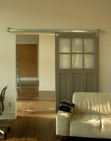
The lovely barn door
I’ve been seeing a lot of interior decor that involves the barn door. I haven’t really completely appreciated the barn door yet, but somehow, when refurbished, it can easily be the missing piece of the room, if not the highlight of it.
It first caught my attention when it was used as the doorway to the bathroom.
Naturally, I find the used barn door more charming. But these modern twists are not that bad at all. It is a perfect separation for two spaces.

 I love the fact that it cleanly divides working space from living space!

 But I think I fell in love when it was used in contrasts and almost blending in to everything in the room.

 I fell in love with barn doors. Yeah. My house will have one. Definitely.
Gaining wisdom
Interesting things in the morning
For those who know me well, they can surely say that I probably have the shortest attention span. I have to have a place or an activity or website that I can easily go to or visit when I get bored. I have to thank Pinterest for constantly picking me up on hours that I am down; serves as my virtual pin board actually. :)
I was quite delighted to see these two interesting things when I first logged on to prep for work.
Let’s admit it: this cardboard castle is just divine! I absolutely love it. I was thinking if I collect enough boxes and cardboards, it would make a good rainy day project. I don’t know if this is a direct reflection of my emotional quotient, but it’s a really nice work of art. And kids can do it too! They can make their own castle without having to rely on Disney. Hahahaha.
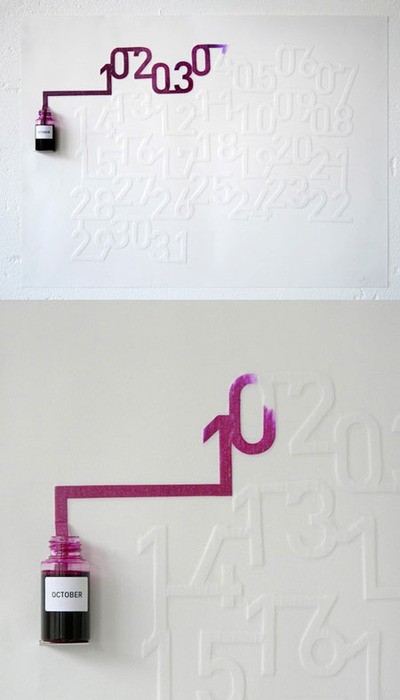
This is the best thing ever! An ink calendar. Yup, you read that right. You get to see the dates because the calendar absorbs the ink as each day passes. How cool is that?!
This is made by an artist named Oscar Diaz. According to his page,
“Ink Calendar” make use the timed pace of the ink spreading on the paper to indicate time. The ink is absorbed slowly, and the numbers in the calendar are “printed” daily. One a day, they are filled with ink until the end of the month. A calendar self-updated, which enhances the perception of time passing and not only signaling it. The ink colors are based on a spectrum, which relate to a “color temperature scale”, each month having a color related to our perception of the whether on that month. The colors range from dark blue in December to, three shades of green in spring or oranges, red in the summer. The scale for measuring the “color temperature” that I have used is a standard called ‘D65’ and corresponds roughly to a midday sun in Western / Northern Europe.
The Ink Calendar was exhibited at the London Design Festival in 2007. I would love to get one of these!
So I guess you can say this is a pretty good morning for me. How about you? How is your morning?


